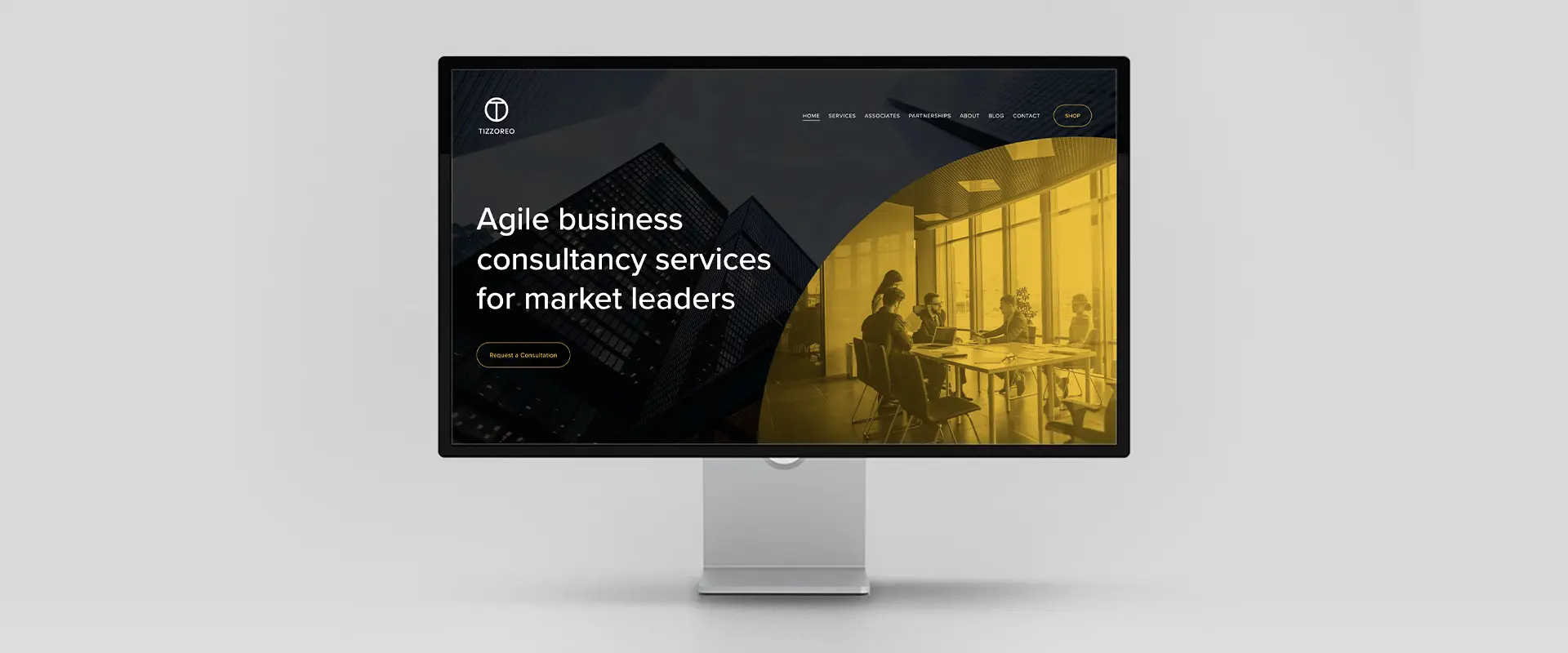
Tizzoreo advises governments, multinational companies, and major institutions through periods of change. The brief was to create a website that reflected that level of responsibility while feeling approachable. The tone needed to be clear and professional without slipping into jargon. And the design had to support content that can grow as the firm takes on new work and publishes insight.
I began with structure. The site maps Tizzoreo’s services to the kinds of problems their clients are trying to solve, using straightforward language that makes it easy to understand how the firm can help. Short, purposeful pages keep attention on the essentials: what they do, who they do it for, why their approach works, and how to get in touch. The aim was to reduce friction for prospective clients and make next steps obvious.
Design choices follow the same principles. The interface is pared back, prioritising clean typography, spacing, and rhythm over decoration. That restraint keeps the site legible on any device and lets the copy carry the message. The result is a look and feel that signals competence without being cold.
I built the site in Squarespace so the team could take ownership of day‑to‑day updates. That choice balances flexibility with simplicity. The team can draft and publish news posts and longer pieces in minutes. And basic changes—adding a service, updating a case study, or posting a role—do not require specialist support.
The outcome is a modern, reliable website that expresses what makes Tizzoreo different and gives prospective clients a clear way to make contact. It supports the firm’s work in a practical way: easy to maintain, easy to understand, and aligned with the standards of their clients.