The Chronic Pain Co-Development Hub needed a brand that puts people first. The platform connects clinicians, researchers, and industry partners with people who live with pain, and shares practical guidance so digital interventions are kinder and more effective.
Any identity had to reflect that purpose. It needed to be warm and welcoming, confident without being clinical, and flexible enough to work across a website, social media channels, and content assets as the Hub grows.
Early sketches explored an abstract human figure to centre the individual. I iterated posture, proportion, and how the figure relates to surrounding forms. The idea was clear, but the tone felt incomplete. Filming interviews changed the direction. Hearing people’s stories—the nuance, the range of backgrounds—made it obvious the first pass didn’t go far enough. The brand needed more character, to represent a wider group of people and give them a mark to get behind.
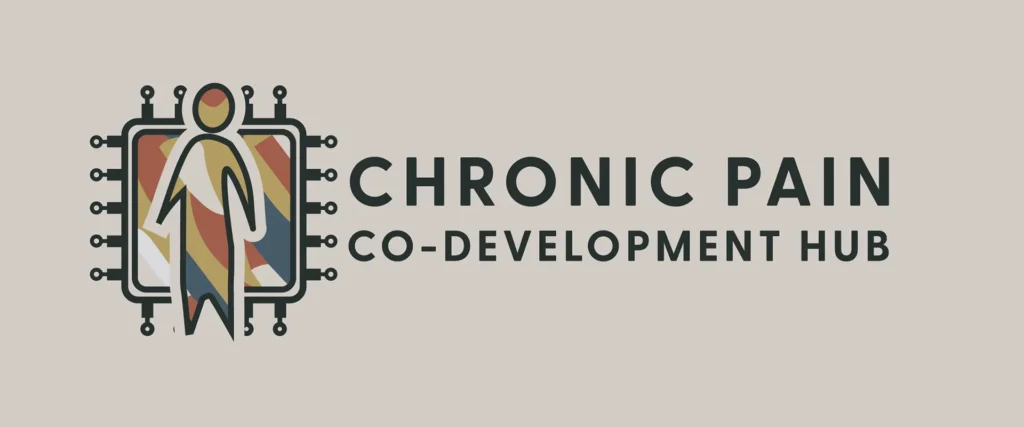
Colour became the bridge. I sampled tones from the interview footage itself: an off‑white from a wall, mustard yellow, blues, reds, and greys drawn from clothing and surroundings. To bring organic complexity into the mark, I scanned my own fingerprint and used its pattern as a multi‑colour texture. It suggests uniqueness without being literal, and underlines a core belief: technology should serve people, not the other way round.
The final symbol places the abstract person above a stylised CPU. The hierarchy is intentional. Technology is present—even celebrated—but secondary to the person it exists to help. I chose Greycliff CF for its modern, modest character and clear legibility in UI and small‑format applications. Together, the elements create an identity that holds its shape across formats while allowing variation in colour and composition.
The result
The result feels aligned with the platform’s aims. It is recognisable without being loud. It carries warmth without sliding into sentimentality. And it gives the Chronic Pain Co-Development Hub a visual language that can travel: on the website, in social media posts, in research resources, and in any future events or campaigns where the community is brought together.