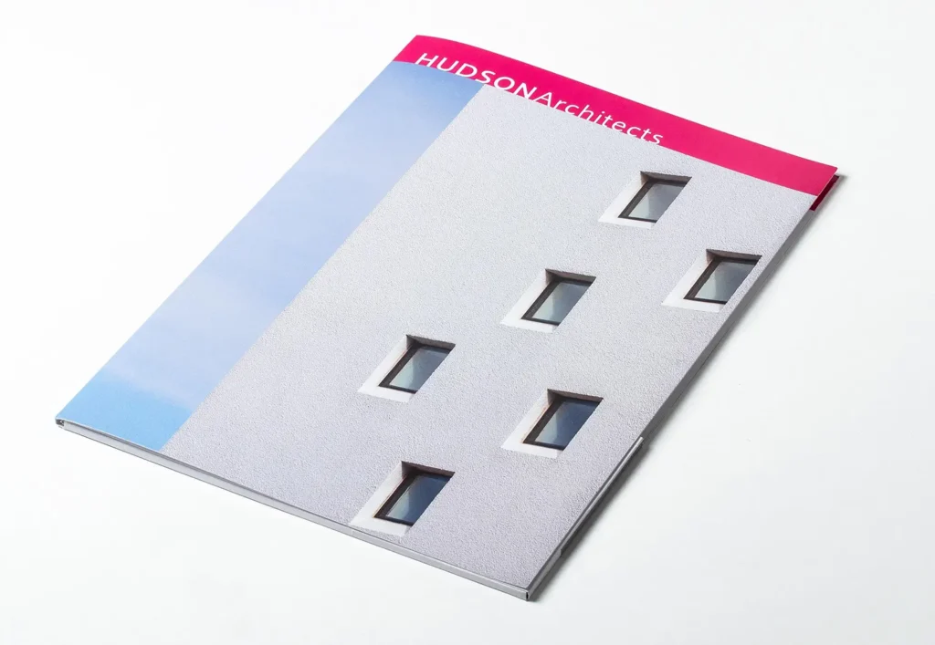
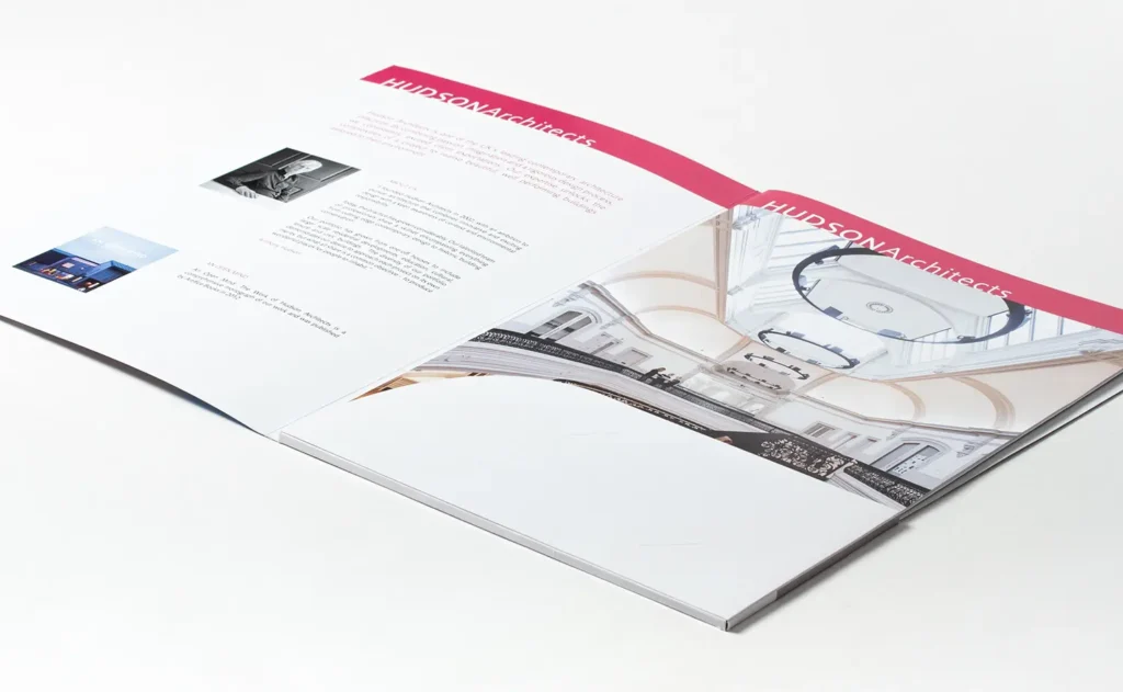
Hudson Architects is a small, design‑led practice known for one‑off houses and carefully made work across sectors. The brief was to create a printed brochure that needed to do two jobs well. It would act as a leave‑behind for prospective clients and serve as a concise introduction to the practice at exhibitions and events. It needed to feel premium in the hand, be simple to update, and carry Hudson Architect’s visual identity with clarity.
Design and production
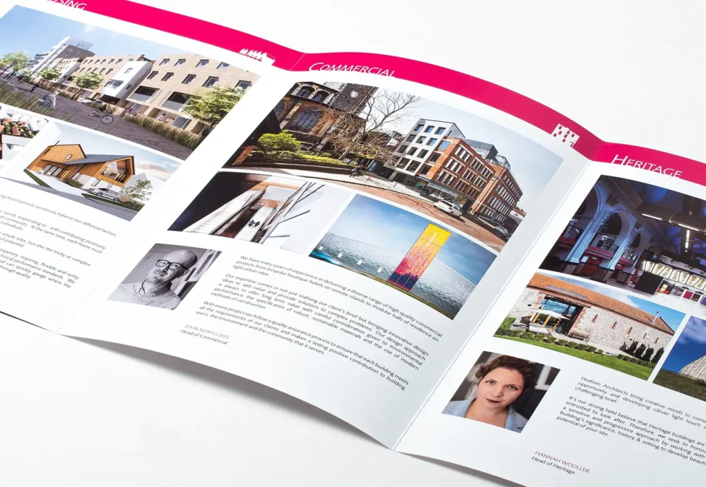
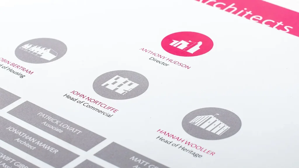
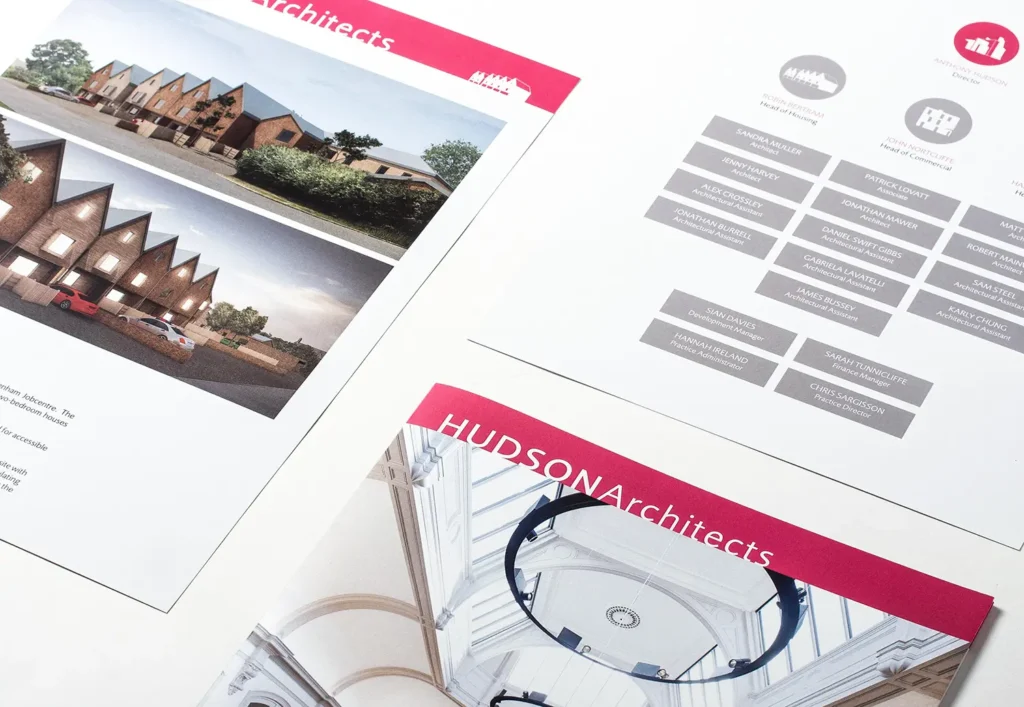
I designed a modular format built around three elements. It includes a folded outer cover, a folded sector insert, and an additional insert that introduced the team and structure of the studio. This approach made updates straightforward. Specific project pages could be added or swapped without reprinting the entire set, and sector content could be tailored to the audience. The sector system used a set of stylised icons created for the brochure, repeated subtly across the documents to tie the pieces together.
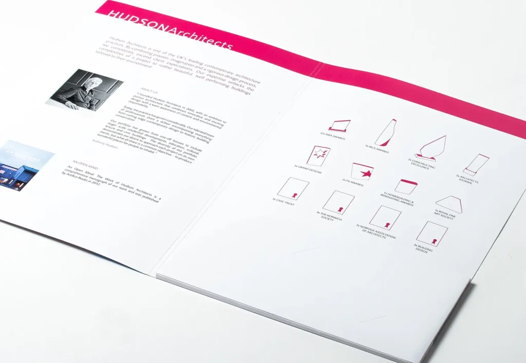
Tone and typography followed the established brand, with Hudson’s signature pink used confidently alongside greys and the practice’s type. The aim was to strike a balance between personality and restraint so the architecture remains the focus. To underline credibility, we illustrated the practice’s awards display from the studio wall. I reduced each award to a clean graphic mark, then arranged them in a quiet grid. The achievement is clear without shouting.
Production mattered. Covers were printed on 350gsm silk for weight and stiffness. Inserts used 200gsm silk to keep the total package tactile and substantial without becoming heavy in the hand. Norwich‑based Hollinger Print handled print, fold, and finish, ensuring colour consistency and crisp trimming across the run. Proofing focused on maintaining image tone and the precise alignment of folds so that spreads closed neatly and icons lined up as intended.
The result
The finished brochure is a calm, confident piece of print. It feels like Hudson’s work: precise, refined, and well judged. In practice it has proved useful at first meetings and events, and its modularity lets the team include project pages suited to a particular client without redesigning from scratch.
